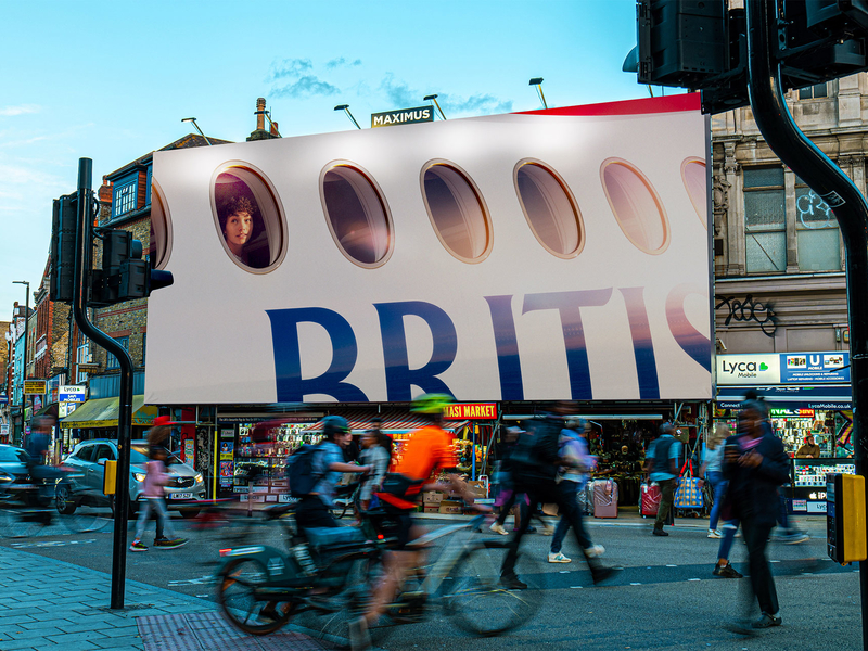
Less Is More: Terrific OOH/DOOH Campaign For British Airways Just Shows People Looking Out Jet Windows
April 5, 2024 by Dave Haynes
Splashy visual illusions that seemingly make products and characters pop a little out of big billboards, to hopefully grab the attention of the public, are everywhere these days. But a recent campaign developed for British Airways is a great reminder that “less is more” simplicity can really deliver.
The UK creative agency Uncommon, part of the Havas empire, has developed and executed a static and digital out of home campaign on posters, totems and billboards around the UK, including the big board in Piccadilly Circus. Instead of over the top motion graphics, there are are 11 iterations of closely-cropped visuals that just show someone looking out a window of a BA jet. There are more than 300 ad placements in London, Edinburgh, Cardiff, and Manchester.
The visuals are so closely cropped the company logo isn’t even complete, but the brand is sufficiently familiar that few onlookers would be puzzled.
Most of the visuals are just images, but there are subtle video pieces, as well, like this …


Leave a comment