LaGuardia Does A Different Take On Flight Status Displays For Travelers
May 24, 2022 by Dave Haynes
Paul Fleuranges sent me a quick note and photos from the mercifully-renovated Terminal B of New York’s LaGuardia Airport – his first time in that or any airport since COVID hit.
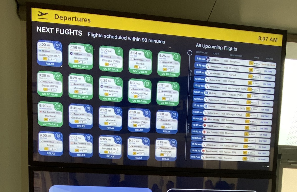
The refresh of an airport that would be generously described as a hell-pit included a big re-think and upgrade of the digital displays at LGA, and industry veteran Fleuranges was impressed by the overall job, and with the interesting approach to the flight information displays.
“My favorite,” he writes in an email, “is the new twist on the Flight Information Display. You can actually read it. Breaks out upcoming flights on fairly sizeable tiles. Green means ya better hurry, blue means you’re good. The tiles also give you walking distance to your gate.”
“I don’t know who developed the look and feel, but it’s very good. For all I know they copied it from another facility.”
Paul, by the way, is on his way to a Digital Signage Federation board meeting and the first full-on networking mixer in forever – a “Meet and Mingle” in downtown Chicago tonight.
I also haven’t seen this approach, but then again I have done one round-trip in planes in 2.5 years, having spent 15 years doing about one a month, and often more.
Breaking out the flights set for the next 90 minutes in a different way, and enhancing the information with things like advice, all make sense to me. The FIDS displays at busy airports can be more than a bit bewildering, and someone coming into the terminal, thinking they may be a bit late, would welcome messaging that says they should hurry and how much time it will take to get to the assigned gate.
I am reliably told that the FIDS concept was pulled together and executed by Boston-based Art of Context, which specializes in visual messaging for airports.
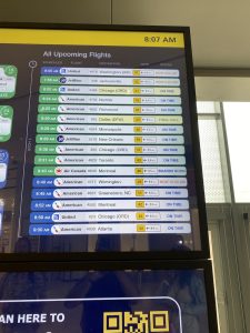
Here are more pix …



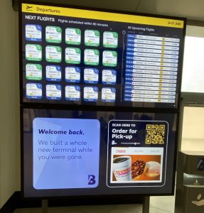
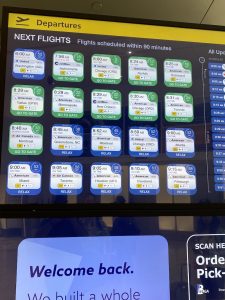
Devoting some traditional FIDS real estate to a dynamic cards system is extremely valuable to travelers.
I’m not involved in the LGA project, but we are using similar designs based on an algorithm which takes into account screen position, walk time to gate, time till departure, gate changes, etc. Prioritizing which flights are the most meaningful at that moment in time for passengers looking at that screen.
I’m glad you like it Dave. Art of Context did the design and UI coding on their Flight Information CMS system. The design came about with a close partnership with the client, LaGuardia Gateway Partners, and many iterations! LGP wanted to reimagine FIDS and influence passenger behavior to stay in the headhouse to enjoy the vast entertainment and concessions offerings there, rather than heading over the pedestrian bridges to the concourses with less amenities. Life size tiles were printed on paper and hung on the wall to make sure we had the right scale. Fun project and indicative of our priority on design. Flight Information in airports desperately need UX improvement.
Looks great Colleen – great work as always!
Colleen this is great work. As a comms person I can appreciate the thought process behind it. Well done.