Beauty Brand Uses Digital Facade At Store To Drive Brand, Traffic And Sales
September 23, 2020 by Dave Haynes
This is a really nice multi-screen project for a beauty brand’s store in Andorra, and a great example for marketers in this industry on what to do when showcasing company work.
The project page is rich in detail and visuals showing what was done, how and why. Too often, I get pitches or news releases that blabber on and on about who did it, and why everyone is excited/delighted/thrilled. But the pictures, if they include any, are attachments and not necessarily useful.
My favorites are handshake photos of the vendor and client, when all I and everyone not related to the project really want to see is what was done, not the people who wrote the check and got the commission.
Anyway, Barcelona-based solutions provider Instronic didn’t do anything like that – instead putting together a single project page and sending out a quick summary email pitch pointing to that page, and also a link to download-ready visuals. Minimal to no blah-blah-blah.
The company also has the video up and viewable on Vimeo.
This project involved Perfumerías Júlia, a specialized cosmetics and perfumes in the world with over 70 stores in Spain and neighboring Andorra. The company, says Instronic, is “evolving its stores, driven by a consumer who wants to be surprised with stimulating new, attractive and service-oriented environments.”

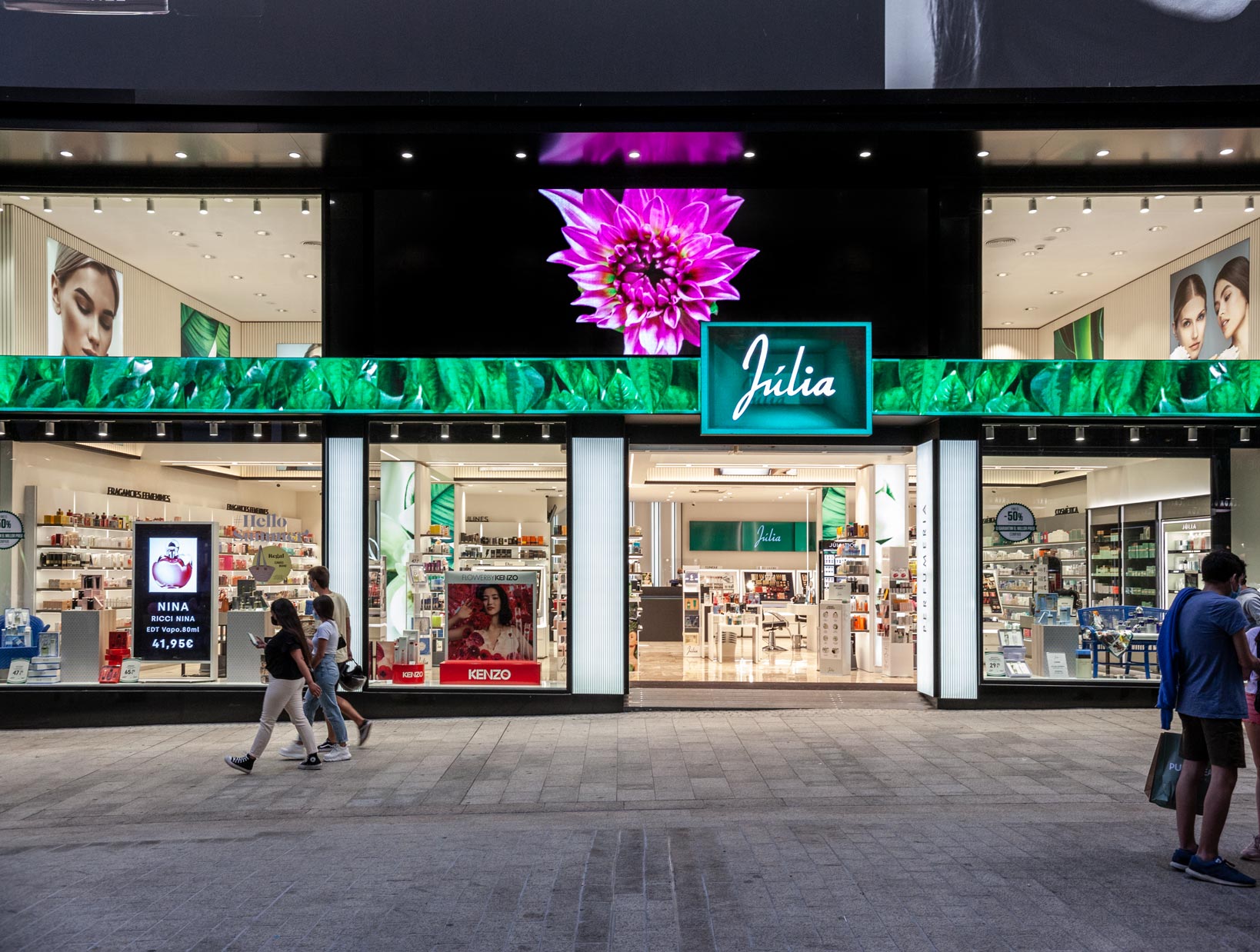
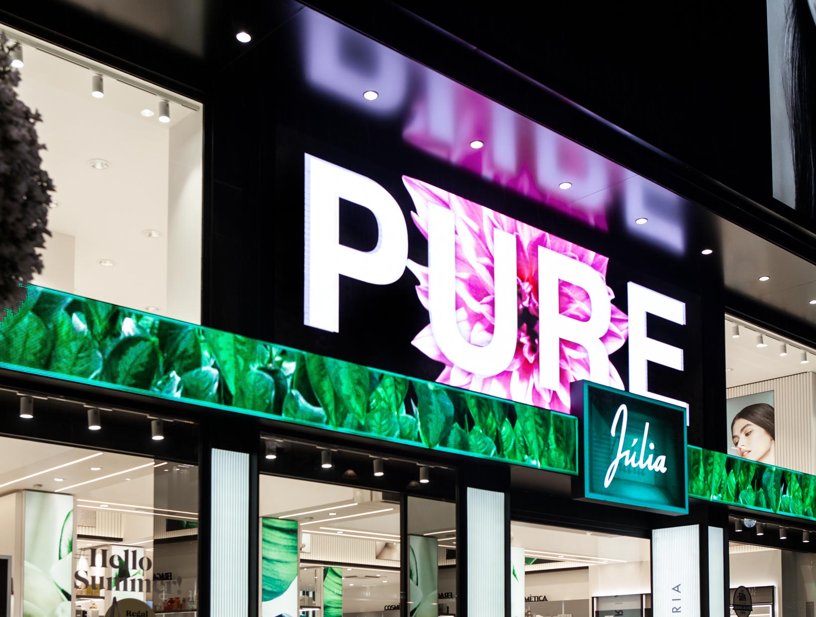
The main feature is a two element digital facade that includes a big direct view LED as the main store header and sign, and a thin horizontal LED strip that’s designed to look like a belt and include a buckle.
There is also digital in the window, facing passers-by and designed to drive calls to action and foot traffic, as well as more screens inside.
I quite like this and as direct view LED matures and prices continue to come down, the surfaces fronting and surrounding retail entrances will, I think, continue to go digital in ways similar to this. When a store designer decides on a look and material, that’s a decision that needs to be lived with for a bunch of years. With digital, the look can change by uploading and scheduling a different set of creative files.
The one thing missing here, setting aside who’s tech was used, is results or impact. It would be useful to relate outcomes, if the client allows that. For example, store sales 2X’d those of a similar store, or whatever.
That said, the project page does go into the strategy, noting how the buckle/belt strip drives the brand identity while the larger LED above it supports partner brands and the products sold in the store.


Leave a comment