NYC’s New The Shed Is Master Class On How To Design, Deliver Digital Signage
January 29, 2020 by Dave Haynes
NYC’s new Hudson Yards development, a mixed use, very high-end set of properties just over from the Javits convention center and by the Hudson River, is turning into a great and hyper-efficient one-stop field trip destination for digital signage nerds.
I’ve written previously about the development, but a reader pointed me today to a new building I think was still being finished up when I was in the city last fall.
This is The Shed – described as New York City’s newest cultural center, commissioning, producing, and presenting “the full spectrum of performing arts in disciplines ranging from dance to music to visual art and beyond.”
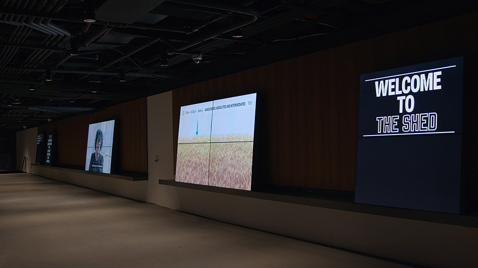
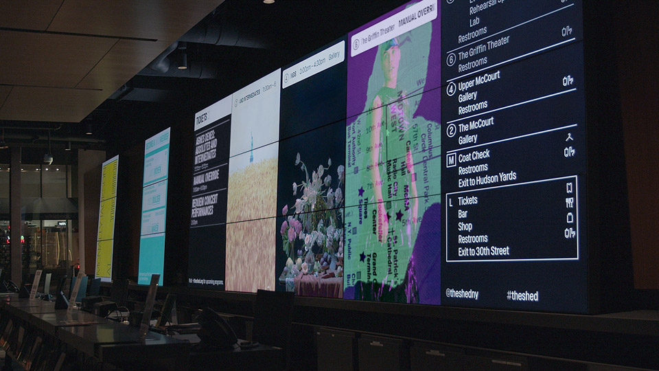
It’s interesting in the context of signage because there are 81 screens located around the nine floors and 200,000 square feet of space. The screens are described as the cornerstone of the center’s visitor experience.
The project was designed and delivered by Rare Volume, a boutique design and tech studio based in NYC’s Chinatown district. It’s terrific.
The company says the project required “a system as flexible and unique as the building itself. Rare Volume designed and produced more than 15 dynamic content templates, all automatically deployed according to each day’s unique schedule through a custom digital signage system.”

I like the minimalist content design, and simple use of motion. I like the way some of the displays are set with a slight tilt on shelves, instead of wall-mounted like 99.99% of what’s in the field. And I like the use of dynamic data.
“Custom signage software combines realtime and near-time graphics, and is fully integrated with the Shed’s website content management system. Intelligent scheduling and rendering algorithms allow the network of displays to deliver location and schedule-aware content throughout the building, automatically.”

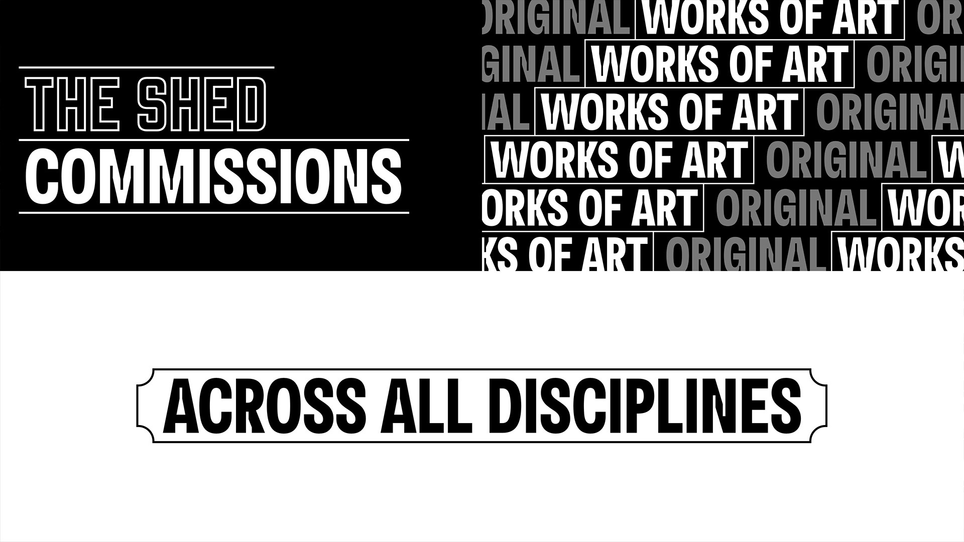
The motion graphics package delivers a range of media and messaging across the network of displays—mission-driven interstitials, program marketing, realtime notifications, neartime-rendered graphic overlays for live action videos, and emergency alerts.
I also like the forehead-slapping simplicity of some of the messaging, which is missing from SO many projects. The screens do things like greet visitors with Welcome and Thanks For Visiting messages, and in stairwells, have simple animations that guide people to continue up or down to a new level of the space.
The designers appear to have stuck with a core mission of helping the visitor experience and kept everything simply presented, but with enough design thought and motion to make it visually interesting.
REALLY well done. Should win awards (if the folks take the time to enter!)


Leave a comment