Chinese Beauty Brand Nu Skin Fills Shenzhen Flagship With Digital Screens
January 22, 2019 by Dave Haynes
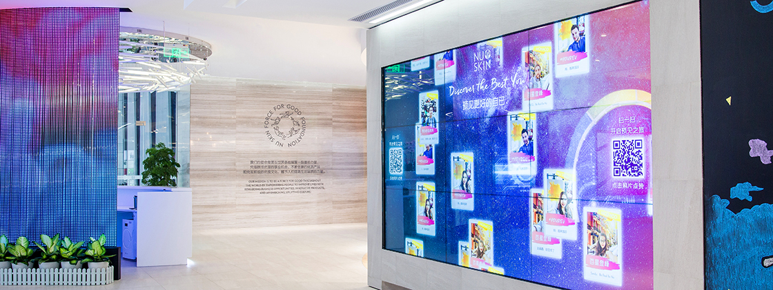
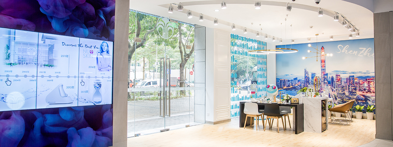
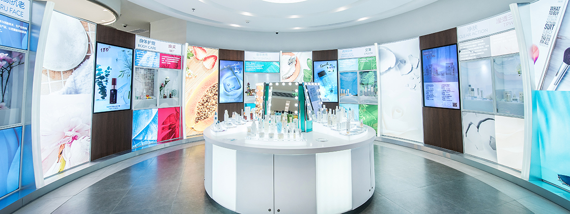
This is a very ambitious, digitally-rich flagship store for Chinese health and beauty brand Nu Skin, opened recently in Shenzhen.
Toronto-based Shikatani Lacroix Design (SLD) worked with consulting firm MetaThink to build a store intended as an experience center that reflected the company’s story and brand culture, and showcased products.

The store has more than 50 screens in a wide variety of configurations.
SLD sums up the project this way:
In partnership with MetaThink, extensive research was conducted by SLD’s strategic team to better understand various pain points from the perspective of Nu Skin, their business partners, and their customers. Through interviews with management and employees, on-site research, audits of competitors and best-in-class industry leaders, brainstorming sessions and workshops, the team was able to determine a design concept that would support Nu Skin’s tagline: “Discover the Best You.” An important aspect of this process was in determining the message that Nu Skin wanted to convey to those that entered the experience center, and how conventional and digital experiences would support this story. More than just a place to buy products, the new store would blur the line between gallery, science center, community hub, and event space.
The new experience center was part of a larger rebrand. The creative needed to constantly be updated while the brand evolved, and the space was still being designed. The experience had to keep people interested, engaged and help recruit new business partners to join. Nu Skin wanted to tell richer stories that would better target customers, demonstrate products and help educate. With a wide range of offerings and unique features, it was important to create a cohesive and choreographed experience that flowed from start to finish. Integration to existing digital tools and applications requiring data exchange added additional levels of complexity to the digital experiences. In very short timelines all of the graphics, wayfinding, digital experiences and environmental design had to constantly evolve and adapt. This meant that SLD had to remain agile and collaborative throughout the entire process.

The experience store design by SLD is centered around the “Fountain of You,” a primary design element, that serves as an interaction piece as well as a visual metaphor. Paying homage to Nu Skin’s logo, the “Fountain of You”, which exemplifies youth, wellness and energy, the design also conveys the idea that each person entering “Nu Xtore” is like a drop of water, and as they journey through the experience, a ripple effect of education, excitement and engagement is delivered through the integrated brand experiences. The theme of these ripples of knowledge serve as the foundation for the entire store design, digital signage, mobile and interactive experiences. Technology serves as the vehicle to help customers navigate the experience store, empowering them through the integration of data, personalized content and larger than life digital experiences.
The first Nu Xtore celebrated its grand opening in November 2018. Located in Shenzhen, China, Nu Xtore is a state-of-the-art digital sensory experience center that incorporates Nu Skin’s history, high-quality products, community involvement and scientific innovation. Nu Skin plans to open additional Nu Xtore’s throughout China, with two more scheduled for 2019, further solidifying Nu Skin as an industry leader in rewarding business opportunities and innovative beauty products. Digital experiences will play a huge role in all the Nu Xtore locations, continuing to empower customers to benefit from Nu Skin’s overarching brand position “Discover the Best You”. The Nu Xtore creates an environment that connects emotionally with both customers and business partners, in the blink of an eye.
The tech set-up includes:
- An 11′ by 10′ LED curtain wall at reception
- A 4 by 1 History Wall
- Video walls in the Body Testing area, including a 1×3 interactive touch video wall
- More screens and wall configurations in areas called AgeLoc, HonorBoard, Force for Good and Discovery. The store also uses a lot of tablets.
- The store runs on Omnivex Moxie, and the screens are mostly LG 55s.
I follow a new store design blog that showcases new builds and renos, and the great majority I see these days have little or nothing in the way of screens inside. So it’s great to see a retailer making the investment into good store design and strategy, and using digital in meaningful ways.


Leave a comment