The DNA of Digital Signage
October 31, 2007 by Dave Haynes

I mentioned last week that I was in Montreal and was around for a presentation by Phil Lenger, of New York’s Show and Tell Productions.
I was too stupid to take notes but Phil has kindly passed along a PDF version of his presentation, so I can relay some of his key points
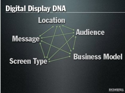
He laid out what he has coined LAMBS, or the DNA of good digital signage. LAMBS is an acronym for:
- Location
- Audience
- Message
- Business Model
- Screen Type
Lenger says these are all variables that need to work together to pull off a successful project. He cited examples of cases in which someone may may have great location and great audience, but no message or business model. We’ve seen that thing over and over again with the Build It and They Will Come approach to networks.
Being a content, he predictably reinforced the proposition that content is absolutely critical for success, and he refreshingly did so without uttering the words: “Content is king.”
Lenger broke down content in digital signage to four themes:
- Branding
- Advertising
- Information and PSAs
- Entertainment and Art (or what Lenger calls “the good stuff”)
The result is, in theory, a pie chart with four equal slices. However, in reality the slices are rarely equal. He said while a clothing store will be heavy on branding messages, an airport may be entirely the opposite — heavy instead on information and advertising.
“Your Job is to determine the ‘shape’ of your pie in conjunction with the Business strategy,” suggests Lenger. “After you start to get a better idea about Business Strategy & Content Strategy, then you can begin to think about your Creative Strategy. What is the Personality.”
By personality, Lenger means role. What the sign is supposed to be all about in the environment. And if it is nothing more than a digital sign hammering ads mercilessly at the audience, it is not going to get much respect or attention and its roles becomes expensive video wallpaper.
As he notes: Your audience came for another reason than to watch your sign.
He wrapped it all up by talking about network operators and integrators should really be thinking through the creative strategy, having strong and secondary elements, and having some pacing to the visual presentation. He warned against the endless temptation of repurposing TV and other content, and stressed again the merits of having that “good stuff” that people will enjoy looking at and referencing.
I’ve asked Phil if I can publish the link so you can download the PDF.


Leave a comment